[Python] 시각화 도구 Plotly
Plotly에 대하여...
Ploty??
Python으로 데이터 시각화를 하신다면 Matplotlib, seaborn이 두 가지 라이브러리가 매우 친숙하실 것 같습니다.
오늘은 예쁘게 시각화를 도와줄 Plotly를 python에서 사용하는 방법을 소개해 볼려고 합니다.
plotly는 python, R, Java를 지원합니다.
설치
작성일자 기준 plotly.com에서 확인한 최신 버전은 4.14.1 입니다.
installed using pip
pip install plotly==4.14.1
conda
conda install -c plotly plotly=4.14.1
실행
html 새 창 보기
import plotly.graph_objects as go
fig = go.Figure(data=go.Bar(y=[2, 3, 1]))
fig.write_html('first_figure.html', auto_open=True)
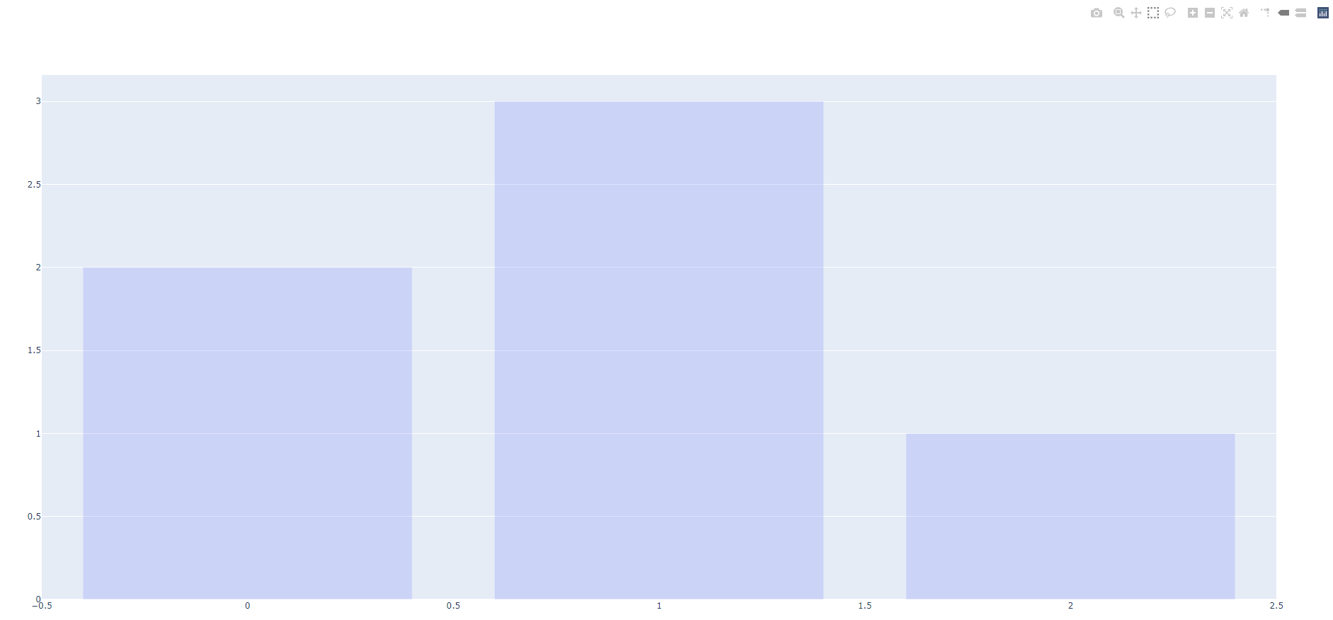
fig.write_html 코드를 통해서 새로운 탭or 브라우저에서 plot을 확인할 수 있습니다.
Basic Chart
px. 뒤에 bar, line, pie, scatter을 변경하여 plot의 종류를 변경할 수 있습니다.
또한 express에 다양한 파라메터를 꼭 한 번 읽어보시는 것도 추천합니다 !!
Parameters
        ----------
        data_frame: DataFrame or array-like or dict

        x: str or int or Series or array-like

        y: str or int or Series or array-like

        color: str or int or Series or array-like

        facet_row: str or int or Series or array-like

        facet_col: str or int or Series or array-like

        facet_col_wrap: int

        facet_row_spacing: float between 0 and 1

        facet_col_spacing: float between 0 and 1

        hover_name: str or int or Series or array-like

        hover_data: list of str or int, or Series or array-like, or dict

        custom_data: list of str or int, or Series or array-like

        text: str or int or Series or array-like

        base: str or int or Series or array-like

        error_x: str or int or Series or array-like

        error_x_minus: str or int or Series or array-like

        error_y: str or int or Series or array-like

        error_y_minus: str or int or Series or array-like

        animation_frame: str or int or Series or array-like

        animation_group: str or int or Series or array-like

        category_orders: dict with str keys and list of str values (default `{}`)

        labels: dict with str keys and str values (default `{}`)

        color_discrete_sequence: list of str

        color_discrete_map: dict with str keys and str values (default `{}`)

        color_continuous_scale: list of str

        range_color: list of two numbers

        color_continuous_midpoint: number (default `None`)

        opacity: float
            Value between 0 and 1. Sets the opacity for markers.
        orientation: str, one of `'h'` for horizontal or `'v'` for vertical.

        barmode: str (default `'relative'`)

        log_x: boolean (default `False`)
            If `True`, the x-axis is log-scaled in cartesian coordinates.
        log_y: boolean (default `False`)
            If `True`, the y-axis is log-scaled in cartesian coordinates.
        range_x: list of two numbers
            If provided, overrides auto-scaling on the x-axis in cartesian
            coordinates.
        range_y: list of two numbers
            If provided, overrides auto-scaling on the y-axis in cartesian
            coordinates.
        title: str
            The figure title.
        template: str or dict or plotly.graph_objects.layout.Template instance
            The figure template name (must be a key in plotly.io.templates) or
            definition.
        width: int (default `None`)
            The figure width in pixels.
        height: int (default `None`)
            The figure height in pixels
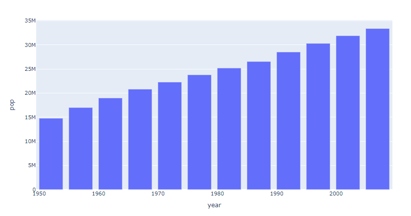
Bar Chart
import plotly.express as px
data_canada = px.data.gapminder().query("country == 'Canada'")
fig = px.bar(data_canada, x='year', y='pop')
fig.show()
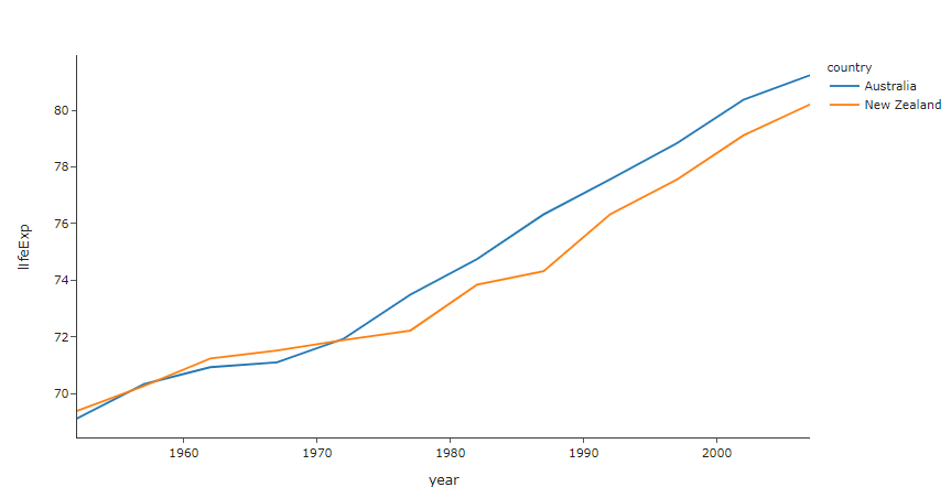
Line Chart
import plotly.express as px

df = px.data.gapminder().query("continent=='Oceania'")
fig = px.line(df, x="year", y="lifeExp", color='country', template="simple_white")
fig.show()
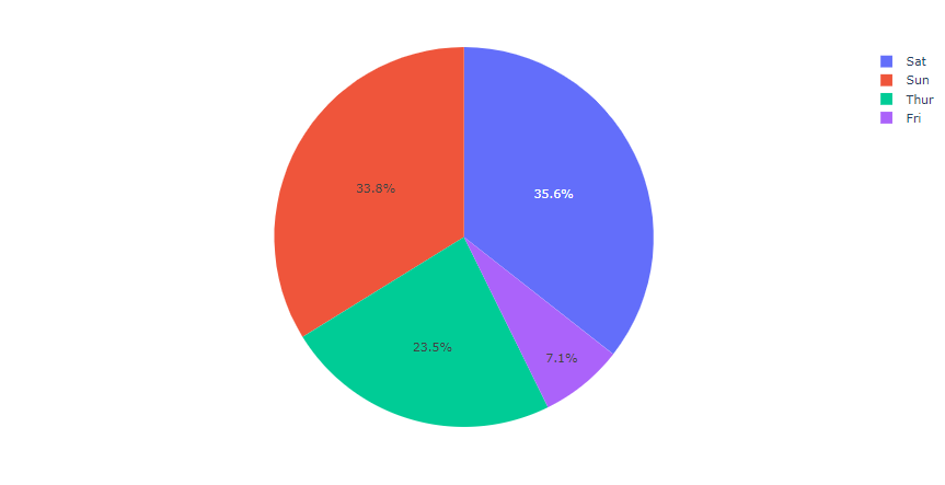
Pie Chart
import plotly.express as px
# This dataframe has 244 lines, but 4 distinct values for `day`
df = px.data.tips()
fig = px.pie(df, values='tip', names='day')
fig.show()
Scatter Plot
import plotly.express as px
df = px.data.iris()
fig = px.scatter(df, x="sepal_width", y="sepal_length", color="species",template="simple_white")
fig.show()
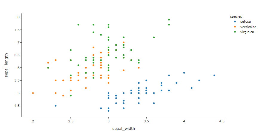
Scatter Plot은 ML의 대표적인 데이터중 하나인 iris 데이터입니다.
px.data.gapminder()에 다양한 기본 데이터가 포함되어있으니 plot.com에서 확인해 보시기 바랍니다.
Conclusion
plotly는 기본적인 plot과 chart 뿐만아니라 pandas와 연계해서 사용할 수 있는 방법입니다.
3D chart, 통계 chart, ML regression 등 상당히 다양한 차트를 시각적으로 표현해는 방법이 다채로운 라이브러리 입니다.
plotly/python으로 들어가시면 더 자세한 사항들을 확인할 수 있습니다.